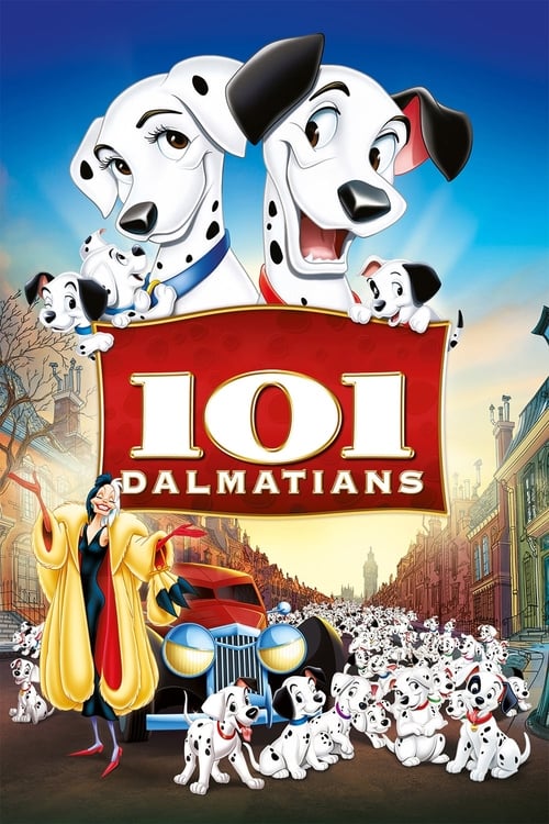
One Hundred and One Dalmatians
1961 · Clyde Geronimi
For a family movie night or a nostalgic comfort watch — cozy and safe, with just enough villainous edge that nobody gets bored. One of the easiest crowd-pleasers in the Disney canon.
What it's about
A London songwriter, his wife, and their two dalmatians have their happy household upended when their litter of fifteen puppies is stolen — snatched on the orders of Cruella De Vil, a chain-smoking fashion monster who wants dalmatian fur for a coat. When the humans fail, the dogs take over: a barking chain of canine communication stretches across England, and the parents set out on a winter rescue that keeps gathering spotted reinforcements.
The experience
Brisk, funny, and genuinely suspenseful for a family cartoon — the kidnapping plot has real menace thanks to Cruella, but the tone stays warm, witty, and dog's-eye charming throughout. It moves like a caper.
Performances
Betty Lou Gerson's voice work as Cruella De Vil is one of the great vocal performances in animation — a purring, shrieking aristocratic nightmare who steals every scene she's in.
The craft
This is the film where Disney abandoned its lacquered storybook look for something scratchy and modern: a new Xerox process transferred the animators' actual pencil lines to the screen, giving everything a loose, graphic, sketchbook energy. The angular mid-century design of London and the countryside still looks stylish, and Cruella's animation is a masterclass in caricature-driven character work.
Why it matters
A massive hit that rescued the studio's finances after an expensive flop and set Disney's visual style for the next two decades — and it gave animation one of its most imitated villains.
Snapshot
One Hundred and One Dalmatians is the film in which Walt Disney Productions stopped trying to out-paint itself. Released in January 1961, two years after the ruinously expensive Sleeping Beauty, it abandoned the lacquered storybook surface that had defined the studio since Snow White and replaced it with a scratchy, graphic, unmistakably modern line — the animator's own pencil drawing, transferred photographically to the cel and left visible on screen. The story is a domestic thriller told at knee height: a London songwriter and his wife, their two dalmatians, a litter of fifteen puppies, and a fashion predator named Cruella De Vil who wants the puppies for their skins. What follows is a kidnapping, a countryside chase, and a rescue coordinated by dogs across the whole of England.
Credited to three directors — Clyde Geronimi, Hamilton Luske and Wolfgang Reitherman, the standing supervisory triumvirate of Disney's late feature era — the film was adapted by Bill Peet alone from Dodie Smith's 1956 novel The Hundred and One Dalmatians, the first Disney animated feature to carry a sole story credit. It was a substantial commercial success, and it rescued the studio's animation department at a moment when that department's survival was genuinely in question. Its consequences were long: the visual grammar it established governed Disney animation for roughly a quarter of a century, and its villain became one of the most durable character designs the studio ever produced.
Industry & production
The context is financial. Sleeping Beauty (1959) had been in production for most of a decade, shot in Technirama 70 with backgrounds built like medieval tapestries, and was the most expensive animated feature made to that point. It did not return its cost quickly, and the aftermath included layoffs in the animation department and serious internal discussion of whether Disney should continue making animated features at all. Walt Disney's own attention had migrated: Disneyland, weekly television, and an expanding live-action slate were where the growth was. Animation, the studio's founding business, had become its most capital-intensive and least predictable one.
One Hundred and One Dalmatians was conceived under that pressure. The single largest line item in a traditional animated feature was ink and paint — the hand-tracing of every animator's drawing onto celluloid in India ink by a large, almost entirely female department, followed by hand-painting on the reverse. Ub Iwerks, Disney's earliest animation partner and by then head of the studio's process laboratory, adapted a Xerox camera to burn the animators' pencil drawings directly onto cels photostatically. The inking stage simply disappeared. The process had been tested on the short Goliath II (1960) — also written by Bill Peet, also directed by Reitherman — and reportedly on isolated elements of Sleeping Beauty before that.
The savings were large enough to make a film with ninety-nine puppies economically thinkable. It is worth being clear about the human cost: the technology that saved the feature program also eliminated the core craft of the ink department, and a great many inkers' jobs went with it. The studio's publicity leaned into the arithmetic from the other direction, circulating a much-repeated count of the total number of spots animated across the film; the figure belongs to promotion rather than to production record, and should be read as such.
Bill Peet's role deserves emphasis. Adapting Smith's novel by himself, he consolidated the book's two canine mothers into the single character of Perdita, converted Roger from a financial expert into a struggling songwriter — a change that motivates the film's few songs from inside the story — and tightened a picaresque novel into a three-act chase. That a single storyman could carry a feature was itself a departure from the crowded story-department method of the 1930s and 40s, and it gave the film an unusual tonal consistency.
Technology
Xerography is the film's defining technical fact, and its aesthetic consequences run deeper than cost. Because the photocopied line reproduced the animator's drawing exactly — including its weight variations, its overshoots, its nervousness — the finished film shows what had previously been buried under an inker's smooth, uniform trace. The line is rough, doubled in places, alive. For animators of the caliber of Milt Kahl and Marc Davis, this was a promotion: their draftsmanship reached the screen unmediated for the first time.
The process also solved a specific problem of scale. Spot patterns for the dalmatians were handled on separate levels and could be duplicated, shifted and recombined rather than redrawn from scratch on every dog; crowds of near-identical puppies could be assembled from a manageable stock of drawings. A film premised on multiplying a spotted animal ninety-nine times is only sane under a duplication technology, and the story and the machine plainly developed in conversation with each other.
The corresponding constraint was color. Early xerography produced a black line only, and no other, which meant that every element on screen was outlined in hard black — flesh, fabric, sky, fire. Ken Anderson's response, as production designer, was to make a virtue of the constraint by carrying the same treatment into the backgrounds: styled, sketchy line work overlaid with color that deliberately does not register with the outlines. Backgrounds and characters therefore belong to one graphic world instead of the traditional split between painted scenery and cleanly inked figures.
Walt Disney is widely reported to have disliked the result, and to have held Anderson responsible for a look he considered cheap and ugly. The anecdote is well attested in studio oral history and should be treated as such rather than as documented policy; what is certain is that Disney never returned the studio to the old inked line in his lifetime, because the economics would not allow it.
Technique
Cinematography
There is no cinematographer in the live-action sense; the equivalent authorship sits with layout, background and the animation camera department. The film is composed for a 1.75:1 flat frame after Sleeping Beauty's vast Technirama widescreen — a narrowing that suits a story about interiors, streets, and the space under furniture.
The camera thinks like a dog. A great deal of the London material is staged low, with human beings entering frame as legs, torsos and looming heads, and the film uses that vantage for both comedy and menace: Cruella at full height in a doorway is a genuinely alarming compositional object. Multiplane and layered pan work is used sparingly and pointedly — most memorably in the winter countryside sequences, where deep, cold, receding fields give the chase real geographic weight.
Walt Peregoy's color styling is the film's least discussed and most decisive contribution. His palettes are muted, chalky and unsentimental: soot-greys and dishwater browns for London, hard blue-white for snow, sour greens and blacks for the De Vil house. Against that restraint, Cruella's red-and-white is a wound in the frame. It is a mid-century designer's palette rather than an illustrator's, closer to contemporary graphic design and to the flat modernism of UPA than to anything in the studio's own back catalog.
Editing
Cutting is credited to Donald Halliday and Roy M. Brewer Jr. The film's rhythm divides cleanly. The first act is comic and unhurried, built on long-held staging and dialogue timing — the park courtship, the Radcliffe household, Roger at the piano. The second and third accelerate into cross-cutting: puppies at Hell Hall, Pongo and Perdita on the road, Cruella's car quartering the country, Sergeant Tibbs stalling for time. The Twilight Bark sequence is the film's most inventive editorial passage, a relay of barks passed from London rooftops to a Great Dane to a countryside collie to a farm, in which montage itself becomes the depiction of a communications network.
Mise-en-scène / staging
The staging is domestic and observational before it is dramatic. The opening — dog owners resembling their dogs on a park promenade — is a graphic joke about silhouette and shape language, and it doubles as a thesis about the film's method: character is design. Hell Hall, the De Vil family house, is staged as a decayed aristocratic ruin, all cavernous dark and dead fireplaces, against the Radcliffes' cramped, warm, plainly rented modern flat. Class is drawn into the architecture.
The film's most confident staging device is scale contrast. Fifteen puppies pressed around a television set, ninety-nine dogs filing across a frozen field, one enormous car bearing down a lane — the picture repeatedly plays a mass of small identical bodies against a single large threatening one.
Sound
The film was released in mono, another retreat from Sleeping Beauty's stereophonic ambition, and it is worth noticing how little the film misses it: this is a picture of doorbells, traffic, television sets and barking, and its soundscape is quotidian by design.
George Bruns's score is light, brass-forward and jazz-inflected — a decisive break from the symphonic-romantic mode Bruns himself had supplied for Sleeping Beauty by adapting Tchaikovsky. Mel Leven wrote the songs, of which the film uses remarkably few. "Cruella De Vil," performed at the piano by Roger (sung by Bill Lee), is diegetic: a character in the film writes it, about a character in the film, and it functions as characterization and needling rather than as a production number. "Kanine Krunchies," a television jingle, is a piece of media satire. The near-absence of the fairy-tale musical apparatus is one of the film's quiet structural innovations.
Performance
The vocal cast plays for naturalism rather than for pantomime. Rod Taylor's Pongo is dry, resourceful and adult; Cate Bauer's Perdita carries the film's real fear. Ben Wright and Lisa Davis give the Radcliffes an offhand married ordinariness that is rare in the studio's work of the period.
Betty Lou Gerson's Cruella is the performance the film is remembered for: a smoker's rasp, aristocratic vowels, and a habit of shifting register mid-sentence from cooing to shriek. It is matched to Marc Davis's animation — Cruella was his last character assignment before he moved to WED Enterprises to work on Disneyland — in which the character is built from unstable angles, a fur coat that behaves like a separate animal, and hands that never stop. Milt Kahl is generally credited with Pongo and Roger, and John Lounsbery with Horace and Jasper, the latter animated as a music-hall double act. The other credited directing animators — Frank Thomas, Ollie Johnston and Eric Larson — divide the remaining human and canine work. Live-action reference was used for the human characters as the studio's practice required; Mary Wickes is reported to have modeled for Cruella, and the character's loping, elbow-led walk supports the attribution.
Narrative & dramatic mode
The film is a domestic melodrama that converts into a chase thriller and never returns. Its subject is the abduction of children, displaced onto dogs — which is precisely what allows it to be as frightening as it is without becoming unbearable. The parents are the protagonists; the humans they live with are, structurally, supporting characters who cannot help.
Pongo narrates the opening in first person, a device that establishes the film's governing joke — that the animals consider themselves the responsible parties and their humans as pets requiring management — and is then quietly dropped once the plot takes over. The dramatic mode is comic-anxious: gag construction and genuine dread alternate scene by scene, with Cruella's violence kept mostly off screen and mostly verbal, which makes it worse. The climax is not a duel but an escape under camouflage, and its resolution is deliberately anticlimactic and domestic: not a kingdom restored, but a household enlarged.
Genre & cycle
It belongs to the studio's contemporary-set animal comedy rather than to its fairy-tale line, a cycle that Lady and the Tramp (1955) opened and that runs forward through The Aristocats (1970), Robin Hood (1973) and Oliver & Company (1988). Within that cycle Dalmatians is the one that most fully commits to modernity: television, advertising, motor traffic, a bohemian songwriter's economic precarity, a villain whose evil is fashion.
It is also a heist-in-reverse and a road film, and it sits alongside the period's live-action animal-adventure pictures — a genre Disney was simultaneously mining in its own nature and live-action divisions — while treating its animals as full subjects rather than as photographed wildlife.
Authorship & method
Authorship here is genuinely distributed, and the director credit is the least of it. Geronimi, Luske and Reitherman functioned as sequence supervisors over a story and design apparatus, with Reitherman in particular consolidating the position he would hold as sole director of every Disney animated feature from The Sword in the Stone (1963) to The Rescuers (1977).
The film's real authors are three. Bill Peet built the screenplay and storyboards single-handed, and his sensibility — brisk, wry, unsentimental, sympathetic to animals and suspicious of adults — is the film's voice; he would leave the studio after The Jungle Book and become a distinguished children's book author. Ken Anderson, production designer, made the aesthetic decision that turned a cost-saving technology into a style, and absorbed the blame for it. Walt Peregoy, color stylist, supplied the palette that makes the style cohere. Add Marc Davis on Cruella, George Bruns on score, Mel Leven on songs, and Ub Iwerks on process, and the credit list is complete in a way no single directorial signature would capture.
Movement / national cinema
This is Hollywood studio animation, but it is the moment at which Hollywood studio animation absorbed the graphic modernism it had spent a decade resisting. UPA's flat, stylized, design-led films of the late 1940s and 50s had made the Disney house style look expensively old-fashioned; television animation — Hanna-Barbera's Huckleberry Hound (1958) and The Flintstones (1960) — had made full animation look economically indefensible. Dalmatians answers both by finding a mode that is graphically modern without being limited: the drawing is loose and stylized, but the animation underneath it is still full, weighted and character-driven. The look has an evident affinity with the pen-line illustration culture of the period — the world of Ronald Searle and mid-century commercial graphics — though the connection is one of shared moment rather than documented borrowing.
Its Englishness is real but adapted. Smith's novel is a specifically English book, and the film keeps its London, its Suffolk countryside, its class textures and its voices, filtered through an American studio's idea of them.
Era / period
1961 is a hinge. Walt Disney had four years to live and was concentrating on Disneyland, television and the live-action productions that would culminate in Mary Poppins (1964). The animation department was smaller than it had been and would keep shrinking. The generation that made Snow White was in its late maturity, and the studio's succession problem — never solved in Disney's lifetime — was already visible.
The film registers its decade in content as well as method: a world of advertising jingles, television schedules, small flats and motor cars, in which the villain's power is the power of money and conspicuous consumption rather than of magic. It is the first Disney animated feature that looks like it was made in the year it was released.
Themes
Family as the unit of resistance. The film's moral center is a nuclear family that turns out to be extendable: the rescue ends with eighty-four adopted strangers absorbed into a household that cannot obviously afford them, and the film treats this as the happy ending rather than as a problem.
Consumption as predation. Cruella wants living things converted into an object of display. The film draws no metaphorical veil over this — the coat is the point — and its critique of fashion as a system that renders bodies into material is unusually direct for a family film of the period.
Class. The De Vil name, the ancestral wreck of a house, the inherited wealth and the hired thugs are set against the Radcliffes' precarious creative-class thrift, and the film's sympathies are unambiguous.
Networks and mutual aid. The Twilight Bark is the film's great idea: a horizontal, volunteer, cross-country communication system operated entirely by the powerless, and the mechanism by which the rescue actually happens. Critics have often read it against the memory of wartime England — evacuated children, rumor networks, civil defense — and while that reading is interpretive rather than authorial, it accounts for the sequence's peculiar emotional force.
The animal's-eye view. Sustained more rigorously here than in Lady and the Tramp: humans are large, slow, well-meaning and largely useless, and competence belongs to the dogs.
Reception, canon & influence
Contemporary reviews were broadly favourable, with particular praise for the film's wit, its modern design and Cruella; some critics registered the departure from the studio's painterly tradition as a loss. It was among the year's more successful releases and was reissued theatrically several times over the following decades, becoming a standard of Disney's re-release economy and, later, one of the studio's major home-video titles. Its awards record is thin — this was not a picture that attracted significant industry honors — and that thinness is itself typical of how animated features were regarded before a dedicated Academy category existed. Dodie Smith is reported to have been pleased with the adaptation, which is not the usual fate of a novelist at Disney's hands.
Backward. The film draws on Smith's novel; on Lady and the Tramp for its street-level canine society and contemporary setting; on UPA's graphic modernism for permission to stylize; and on the studio's own live-action reference tradition for its human performance. Its economics were dictated by Sleeping Beauty's example, in the negative.
Forward. The xerographic line became the Disney house style for a generation — The Sword in the Stone, The Jungle Book, The Aristocats, Robin Hood, The Rescuers all wear it — and the studio did not fully recover a clean, colored line until the electronic ink-and-paint systems of the late 1980s. More consequentially, the film demonstrated that feature animation could survive the television era by rethinking its process rather than its ambitions, a lesson the industry has relearned at every subsequent technological transition.
Cruella De Vil outlived the film. She anchors a franchise unusual for being driven entirely by its antagonist: a live-action remake in 1996 with Glenn Close, a sequel in 2000, a television series, a direct-to-video animated sequel in 2003, and Cruella (2021), which reframes her as a countercultural fashion origin story. Marc Davis's design — the asymmetric hair, the cigarette holder, the coat that moves independently of the body — is one of the small number of animated character designs that circulates as free-standing iconography, and it set a template for the tall, angular, self-delighted Disney villain that later designers worked from for decades.
Reception
A huge hit in 1961 that helped rescue Disney animation after Sleeping Beauty's costly underperformance — but Walt Disney himself was famously cool on its scratchy Xerox look, which animators and designers have since come to celebrate as one of the studio's most stylish achievements.
How One Hundred and One Dalmatians was received, from release to now →
How to watch One Hundred and One Dalmatians: what to notice on a first viewing
- Notice how often the camera stays low, at dog height. Much of the London material is staged low, with humans entering the frame as legs, torsos, and looming heads rather than full figures. Shooting from a dog's vantage makes Cruella's full-height appearances in a doorway genuinely alarming.
- Watch Cruella's red and white against the muted colors around her. Walt Peregoy keeps London in soot grays and dishwater browns and the De Vil house in sour greens and blacks, so Cruella's bold red and white stands out sharply wherever she appears. A single unmuted color scheme marks danger the moment she enters any scene.
- Compare the De Vil house to the Radcliffes' flat. Hell Hall is staged as a decayed aristocratic ruin of cavernous dark rooms and dead fireplaces, set against the Radcliffes' cramped, warm, plainly rented home. Class difference is built directly into the architecture, without a line of dialogue explaining it.
- Watch the small identical shapes set against one large threatening one. The film repeatedly stages scale contrasts: fifteen puppies around a television, ninety-nine dogs crossing a frozen field, one enormous car bearing down a lane. The recurring scale contrast makes vulnerability and threat legible at a glance, again and again.
- Listen for the villain song sung by a character, not over credits. Roger performs Cruella De Vil at the piano, a song he writes about a person he actually knows, rather than a standalone musical number. Making the song diegetic turns it into characterization and needling instead of spectacle.
The whole guide to watching One Hundred and One Dalmatians, with the keys for a rewatch →
Influences: the films it descends from and the films it influenced
- Lady and the Tramp (1955) — Established Disney's low, dog-height camera for a contemporary urban setting — humans cropped at the knee, sidewalks and table legs as architecture — plus the citywide canine social network that 101 Dalmatians formalizes into the Twilight Bark relay.
- Goliath II (1960) — The studio's proof-of-concept short for Ub Iwerks's modified Xerox camera: animators' pencil drawings transferred directly to cels, so the feature inherited both the working method and Bill Peet's solo story-and-board authorship a year in advance.
- Sleeping Beauty (1959) — An ancestor by negation — Eyvind Earle's hand-inked, tapestry-flat 70mm design blew the budget and made xerography mandatory — and by direct transmission, since Marc Davis carried Maleficent's tall, angular, cape-driven silhouette straight into Cruella.
- Gerald McBoing-Boing (1950) — UPA's flat, graphic backgrounds and abstracted color fields gave Ken Anderson the industry permission to abandon Disney's painterly depth for stylized planes with no atmospheric perspective.
- Rooty Toot Toot (1951) — Made the drawn line itself a visible design element rather than a boundary to be hidden under paint, and married angular character construction to a jazz-idiom score — both preconditions for the black xerographic outline and George Bruns's jazz-inflected cues.
- Toot, Whistle, Plunk and Boom (1953) — Disney's own in-house modernist experiment, proving to Burbank management that a stylized, outline-forward graphic look could carry a Disney release — the internal precedent Anderson cited when defending the xerographic style.
- Snow White and the Seven Dwarfs (1937) — Founded the live-action reference tradition — actors filmed on a stage for animators to study — which supplied the naturalistic body acting of Roger, Anita and Cruella against otherwise heavily graphic staging.
- Lifeboat (1944) — Tallulah Bankhead's fur-draped, cigarette-punctuated drawl is the acknowledged model for Betty Lou Gerson's Cruella — the specific vocal attack of a woman performing her own glamour as aggression.
- Alice in Wonderland (1951) — Ken Anderson's Xerography-enabled visible-line style, where the animator's pencil line survives onto the cel and backgrounds are offset color washes, completes Alice's rejection of hand-inked illusionism by making the drawing itself the finished surface.
- The Sword in the Stone (1963) — First full feature built natively on the xerographic pipeline, with Peet again writing solo and Reitherman assuming the sole-director post he would hold for fifteen years — the personnel and process settlement 101 Dalmatians created.
- The Jungle Book (1967) — Extends the scratchy black outline and the jazz-inflected diegetic song into character construction itself, casting Phil Harris to scat in character so the vocal performance drives the animation rather than following it.
- The Aristocats (1970) — A near-restatement of the formula: contemporary-set urban animal society, low animal-vantage staging, muted Peregoy-descended palette over visible xerographic line, and a swing-band score functioning as the animals' own culture.
- Robin Hood (1973) — The style at its most exposed — outlines left rough, whole cycles of animation retimed and reused from earlier features — showing what happens when the cost logic that produced xerography is followed past the point where design discipline compensates for it.
- The Rescuers (1977) — Reruns the Twilight Bark structurally: an animal communication network relays word of an abducted child across distance, with the cross-cut chase between animal rescuers and a flamboyant female captor as its climax.
- The Secret of NIMH (1982) — A descendant by repudiation — Bluth's defectors restored hand-inked colored lines, multiplane depth and backlit effects specifically to undo the xerographic house style that had governed Disney animation since 1961.
- Oliver & Company (1988) — Closes the loop and the era at once: the street-dog society and low-vantage contemporary city return, but the line is finally cleaned up by digital ink-and-paint and CGI vehicles, ending xerography's twenty-seven-year run.
- Cruella (2021) — Builds an entire live-action feature on Marc Davis's design as free-standing iconography — the asymmetric black-and-white hair, the cigarette holder, the coat animated to move independently of the body — reverse-engineering costume and choreography from a drawing.
- Gay Purr-ee (1962) — UPA's feature-scale answer to the same problem — animal society in a stylized period city rendered in flat modernist color, with backgrounds designed as graphic panels rather than illusionist space.
- A Boy Named Charlie Brown (1969) — Builds a feature from a deliberately un-inked, wobbling hand-drawn line over a jazz-piano score (Vince Guaraldi), staged at child eye level — the same wager that visible drawing plus jazz reads as modern rather than cheap.
Similar films
- The Jungle Book (1967) — influence & lineage · same viewing thread
- Cruella (2021) — influence & lineage
- Fantasia (1940) — same viewing thread
- Tangled (2010) — same viewing thread
- Beauty and the Beast (1991) — same viewing thread
- Alice in Wonderland (1951) — shared sensibility
- Mary Poppins (1964) — shared sensibility
- Marona's Fantastic Tale (2020) — shared sensibility
All the films related to One Hundred and One Dalmatians →
Watch it with: curated runs of related films
- Disney's Animated Golden Ages — Watch these together to trace Disney's storybook house style across three eras — the 1940 concert experiment, the hand-drawn renaissance, and the CG revival — and hear how each generation quotes the last.