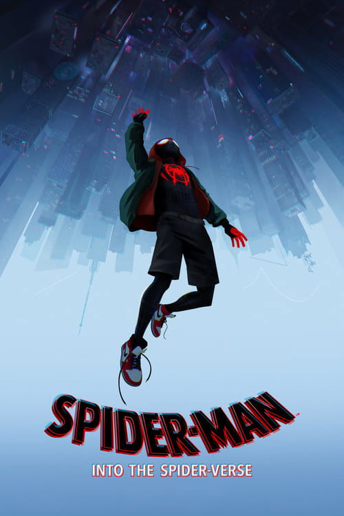
Spider-Man: Into the Spider-Verse
2018 · Bob Persichetti
A near-perfect crowd-pleaser: for family night, for cheering yourself up, for showing someone what animation can do. Pure comfort with real craft under it.
What it's about
Miles Morales is a Brooklyn teenager juggling a new school and a loving, complicated family when a radioactive spider bite hands him powers he never asked for. Then Kingpin's super collider tears holes between universes, and Spider-People from other worlds start dropping into his — leaving Miles, the least experienced of them all, to figure out what kind of hero he wants to be.
The experience
Exhilarating, funny, and unexpectedly moving — it snaps along with the rhythm of a great comic book but keeps circling back to a kid and his family. It's the rare superhero film that leaves you lighter than it found you.
Performances
Shameik Moore makes Miles instantly lovable, and Jake Johnson's washed-up, sweatpants-era Peter B. Parker is one of the great reluctant-mentor turns — funny and quietly sad in the same breath.
The craft
It invented a visual language from comic-book printing itself — Ben-Day dots, misaligned colors, thought balloons and panel borders invading the frame — and animates Miles at a different rhythm than the heroes he's measuring himself against, so his growth is something you can literally see. Produced under Phil Lord and Christopher Miller, with a script as nimble as the images.
Why it matters
It won the Oscar for Best Animated Feature and split American studio animation into before and after — the stylized, expressive look of countless films since traces straight back to it.
American studio animation divides into before and after this film. Produced under the gleefully irreverent eye of Phil Lord and Christopher Miller, it introduced Miles Morales — an Afro-Latino kid from Brooklyn — to moviegoing audiences by inventing a visual language worthy of him: Ben-Day dots and CMYK misregistration lifted from cheap newsprint, thought balloons and panel borders invading the frame, characters animated 'on twos' so their movement carries the staccato snap of a flipped comic. What could have been gimmickry becomes expressive grammar; Miles literally moves at a different frame rate than the hero he's measuring himself against, until he doesn't. The screenplay is equally nimble, wringing genuine pathos from the multiverse premise years before it curdled into franchise boilerplate. It took the Animated Feature Oscar away from Pixar and Disney, and within five years its fingerprints — mixed media, painterly stylization, the death of house-style realism — were visible everywhere from Puss in Boots to TMNT. A whole industry saw what animation could be and scrambled to catch up.
A Deleuzian reading
Get close enough to the screen and Miles Morales is made of dots.
The full Deleuzian reading of Spider-Man: Into the Spider-Verse →
Reception
Greeted with pre-release shrugs — a third big-screen Spider-Man continuity in a decade, animated, no Tom Holland — it landed as an instant critical sensation, won the Best Animated Feature Oscar over Pixar and Disney, and is now routinely credited with changing the look of mainstream American animation.
How Spider-Man: Into the Spider-Verse was received, from release to now →
Influences: the films it descends from and the films it influenced
- Hulk (2003) — Pioneered live-action comic-panel multiplicity — split-screen inset frames, panels that slide and shatter across the composite image — the same in-camera page-grammar Spider-Verse revives as overlaid staging panels.
- Speed Racer (2008) — Established the hyper-saturated, candy-flat pop-art plane compositing with layered foreground/background sliding and comic wipe transitions that Spider-Verse translates into CMYK color blocking.
- Gerald McBoing-Boing (1950) — UPA's limited-animation doctrine — deliberately holding frames, animating on twos and threes as an expressive choice rather than a cost — is the historical root of Spider-Verse's variable-frame-rate 'stepped' motion.
- Cloudy with a Chance of Meatballs (2009) — Lord and Miller's first feature codified their squash-heavy cartoon staging and gag-dense elastic timing — the authorial sensibility they later imposed on Spider-Verse as producers.
- Paperman (2012) — Disney's Meander tool fused hand-drawn expressive line over CG models, proving 2D linework could ride a 3D rig — the precise hybrid Spider-Verse scales up with hand-painted ink lines and stippling on CG characters.
- The Peanuts Movie (2015) — Rendered CG deliberately to read as flat 2D — snap-posing, on-twos motion and drawn detail lines held on the face — an immediate proof-of-concept for CG that rejects photoreal house-style smoothness.
- Akira (1988) — Anime's kinetic vocabulary — speed lines, motion smears, impact frames and held dramatic poses — supplies the emphasis-editing grammar Spider-Verse borrows for its action beats and onomatopoeia titles.
- The Lego Movie (2014) — Lord and Miller forced CG to emulate a tactile handmade medium (chunky stop-motion cadence, real-brick constraints), the same 'make the digital look built-by-hand' impulse that drives Spider-Verse's misregistration and dot-screen texture.
- WALL·E (2008) — Into the Spider-Verse extends WALL·E's CGI lens-imperfection methodology into a systematic aesthetic program: halftone printing dots, off-register color layers, speed-lines, and deliberately variable frame-rate animation are engineered artifacts of a printing or screening medium introduced into computer-generated imagery — the same principle of purposeful technical imperfection as emotional and expressive tool that Deakins's consultancy pioneered for WALL·E's Earth sequences.
- Spider-Man 2 (2004) — Inherits the priority on comic-panel action legibility and the everyman-under-the-mask sincerity, translating Raimi's swing kinetics into animated form.
- Scott Pilgrim vs. the World (2010) — Fully animates the comic-book HUD vocabulary—onomatopoeia overlays, thought captions, halftone dots, panel splits—Scott Pilgrim smuggled into live action.
- Tangled (2010) — The mainstream apotheosis of non-photorealistic, hand-drawn-inflected CG that Tangled's painterly-rendering experiments anticipated a decade earlier.
- Puss in Boots: The Last Wish (2022) — Directly adopted Spider-Verse's variable frame rate — dropping heroes to animating-on-twos for storybook-illustration snap — plus visible brush-stroke backgrounds and bold ink outlines.
- The Mitchells vs. the Machines (2021) — From the same Lord/Miller producing team, it layers 2D doodle overlays — sparkle emoji, hand-drawn hearts and scribbles — directly onto the CG frame, extending Spider-Verse's comic-annotation compositing.
- Spider-Man: Across the Spider-Verse (2023) — Escalates the original's premise by giving each universe a wholly distinct rendering language — watercolor bleed for Gwen, Ben-Day-dot flatness for Mumbattan — pushing per-character art-style compositing to its limit.
- Teenage Mutant Ninja Turtles: Mutant Mayhem (2023) — Extends the death-of-house-style ethos into a teenage-sketchbook aesthetic — visible pencil crosshatching, ballpoint scribble textures and deliberate wobble lines — treating the frame as a hand-drawn page like Spider-Verse's ink work.
- Nimona (2023) — Carries forward the stepped variable frame rate and graphic-novel flatness, staging emotional beats on held on-twos poses rather than the smooth interpolation of prior CG-feature convention.
- Spider-Man: No Way Home (2021) — Codifies the multiverse team-up of alternate Spider-people meeting and comparing origin scars; No Way Home is essentially its live-action realization with mentor-swapping banter.
- KPop Demon Hunters (2025) — Established the Sony non-photoreal CG grammar KDH runs on — halftone Ben-Day dots, chromatic-aberration offsets, hand-inked line work over 3D geometry, and characters animated on 2s to mimic drawn frames rather than smooth CG interpolation.
- Entergalactic (2022) — Establishes the non-photorealistic CG pipeline Entergalactic runs on — Ben-Day halftone dots, deliberate chromatic-aberration offset on out-of-focus planes, hand-inked line overlays, and characters animated on twos to fake a hand-drawn cadence.
- Loving Vincent (2017) — Foregrounded visible brushwork and painterly surface as the animation's whole point — a contemporary declaration, alongside Spider-Verse, that the mark-making itself can be the aesthetic, not hidden under realism.
- Klaus (2019) — Layered volumetric hand-painted lighting onto traditional 2D drawings to fake dimensionality, a parallel-year rebellion against flat digital realism that shares Spider-Verse's 'painterly texture over form' ambition.
- The Bad Guys (2022) — DreamWorks' post-Spider-Verse pivot to 2D-inflected CG — cel-shaded flat color, graphic linework and comic-panel speed-frame action — a studio-wide adoption of the stylization Spider-Verse legitimized.
- Everything Everywhere All at Once (2022) — Concurrent development of the universe-specific formal signature—each dimension has a distinct chromatic palette, visual style, and sonic register—as the expressive grammar of multiverse storytelling, with lo-fi aesthetic choices (halftone dots, misregistered color) treated as deliberate artistic register rather than budgetary constraint.
- Project Hail Mary (2026) — Produced by Lord & Miller, it extends their recurring mentorship-between-mismatched-figures structure that the cross-species partnership in PHM directly continues.
- Wolfwalkers (2020) — Foregrounds visible construction — comic linework, halftone, un-erased hand marks — sharing Wolfwalkers' rejection of smooth photoreal 3D in favor of leaving the mark-making on screen.
- The First Slam Dunk (2022) — Renders 3DCG with comic-panel ink outlines, halftone and stepped framerates so the animation reads as printed page art — a parallel solution to putting a hand-drawn manga line onto CG geometry.
- Superman (2025) — Shares crowded comic-panel maximalism—dense multi-figure frames and graphic pop lettering/color energy—as a way to make the page's density cinematic.
- The Wild Robot (2024) — Broke from photoreal rendering toward stepped frames and visible illustrative marks, legitimizing the non-photoreal, hand-worked CG aesthetic Wild Robot pushes toward oil-painting.
- The Man from U.N.C.L.E. (2015) — Direct collaborator lineage: Daniel Pemberton's genre-blending, texture-first scoring — launched as tone co-author on U.N.C.L.E. — reaches full flower here.
- Big Hero 6 (2014) — Parallel animated superhero-origin that fuses comics panel logic with anime-derived stylization and a grief-arc mentorship, extending the same anime-plus-superhero hybrid craft toward an explicitly non-photoreal rendering.
- The Super Mario Bros. Movie (2023) — Legitimized stylized non-photorealistic rendering in mainstream CG animation, the departure-from-Pixar-photorealism surfacing that Mario's stylized textures and aggressive virtual camera exploit.
Similar films
- Spider-Man: Across the Spider-Verse (2023) — influence & lineage · same viewing thread
- Teenage Mutant Ninja Turtles: Mutant Mayhem (2023) — influence & lineage · same viewing thread
- The Lego Movie (2014) — influence & lineage
- Nimona (2023) — influence & lineage
- The Mitchells vs. the Machines (2021) — influence & lineage
- Akira (1988) — influence & lineage
- Spider-Man: No Way Home (2021) — same viewing thread
- Spider-Man: Far From Home (2019) — same viewing thread
All the films related to Spider-Man: Into the Spider-Verse →
Watch it with: curated runs of related films
- Anyone Can Wear the Mask — A run of every screen Spider-Man — from Raimi's earnest Queens kid to the multiverse's infinite web-slingers — where the rival reboots stop competing and start rhyming into one myth retold.