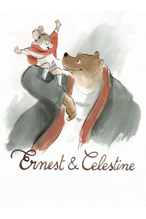
Ernest & Celestine
2012 · Stéphane Aubier
For a cozy night in when you want your heart warmed — perfect with kids, just as good without them. Pure comfort, with more brains than it needs to have.
What it's about
Bears live above ground, mice below, and each side is raised on scary stories about the other. Celestine is an orphaned mouse who'd rather draw than follow the dental career mapped out for her; Ernest is a big, broke, artistically inclined bear. When they collide, their unlikely friendship tips into a shared life of petty crime that scandalizes both worlds.
The experience
Warm, funny, and gently subversive — it flows by like a storybook read aloud, with bursts of caper energy and moments of real tenderness. It leaves you lighter than it found you.
The craft
The animation is hand-drawn watercolor that blooms and fades at the edges of the frame, its linework breathing like a sketchbook come to life — a deliberate answer to digital gloss. Adapted from Gabrielle Vincent's beloved picture books with a script by novelist Daniel Pennac, it's as lovely to look at as anything animated in its decade.
Why it matters
A celebrated proof that traditional hand-drawn animation could still enchant in the CG era, and a high-water mark for the Franco-Belgian animation tradition it grew from.
In a world neatly divided — bears above ground, mice below, each raised on horror stories about the other — an orphaned mouse artist and a hungry, bohemian bear fall into friendship, then into outlawry, their bond scandalizing both societies. Adapted from Gabrielle Vincent's beloved Belgian picture books, with a script by novelist Daniel Pennac, the film unites two strands of Franco-Belgian animation: Stéphane Aubier and Vincent Patar, the anarchic minds behind A Town Called Panic, and Benjamin Renner, whose delicate draftsmanship sets the visual key. And what a key it is — watercolor washes that bloom and fade at the frame's edges, linework that breathes like a sketchbook come to life, a deliberate rebuke to digital gloss. The fable underneath is sturdy stuff about prejudice, class, and chosen family, worn lightly enough for children and pointedly enough for adults. It won the César for Best Animated Film and an Oscar nomination, and its influence is visible across the hand-drawn revival that followed. Few films, animated or otherwise, make gentleness feel this much like a moral position.
A Deleuzian reading
Watch the corner of the frame.
The full Deleuzian reading of Ernest & Celestine →
Reception
It arrived quietly as a subtitled arthouse import in 2012 — Cannes Directors' Fortnight, a César win, a surprise Oscar nod — and has since settled into something bigger: a go-to 'comfort movie' that keeps finding new audiences on Letterboxd.
How Ernest & Celestine was received, from release to now →
Influences: the films it descends from and the films it influenced
- Kirikou and the Sorceress (1998) — Shares producer Didier Brunner and the Les Armateurs house style of flat, hand-painted 2D with unmodulated color fields and no digital gloss.
- The Triplets of Belleville (2003) — Another Les Armateurs/Brunner production that proved a caricatured, wobbling hand-drawn line—not CGI-smoothed—could carry a feature, licensing Ernest's loose ink contours.
- My Neighbor Totoro (1988) — Model for watercolor backgrounds and 'gentleness-as-morality' pacing, where unhurried domestic tenderness rather than villainy drives the drama.
- The Snowman (1982) — Pioneered animating a children's picture book with visible crayon/pencil grain and a soft, wordless storybook texture kept deliberately un-inked.
- The Many Adventures of Winnie the Pooh (1977) — Source of the storybook-adaptation device where painted backgrounds dissolve into bare white page-space, prefiguring Ernest's washes bleeding into unpainted paper.
- Father and Daughter (2000) — Minimalist ink-wash line drawn against wide negative space, the same economy that lets Ernest & Celestine leave much of the frame as untouched watercolor paper.
- The Big Bad Fox and Other Tales (2017) — Renner's own follow-up applies the identical loose ink-and-wash storybook line, framed explicitly as illustrated tales come to life.
- I Lost My Body (2019) — French 2D feature holding the hand-drawn line against 3D orthodoxy, part of the wave Ernest helped legitimize commercially.
- Marona's Fantastic Tale (2019) — Sketchy, deliberately imperfect hand-drawn line and whimsical watercolor color-play in the same anti-slick, illustrative European register.
- Wolfwalkers (2020) — Foregrounds raw pencil line and textured paper grain as a manifesto for hand-drawn craft, the fullest flowering of the revival Ernest signaled.
- Little Amélie or the Character of Rain (2025) — Its loose ink-and-watercolor illustrative line with soft undrawn backgrounds is the house style of the French artisanal studio tradition (a Vallade credit) that the seed extends into feature painting.
- The Summit of the Gods (2021) — Imbert cut his teeth here as animator/editor, absorbing the watercolor-soft, unlined hand-drawn surface and the unhurried editorial breathing room he later imposes on Summit's climbs.
- A Town Called Panic (2009) — Same directors bring their anarchic, deadpan comic timing and clattering slapstick escalation to Ernest's chase and courtroom sequences.
- The Secret of Kells (2009) — Parallel European hand-drawn revival built on flat, ornamental 2D compositions consciously rejecting Hollywood 3D rendering.
- The Illusionist (2010) — Pairs hand-drawn figures with soft watercolor backdrops and a melancholic gentleness, sharing Ernest's palette and restraint.
- The Painting (2011) — French painterly animation that treats the visible brushstroke and unfinished canvas as narrative material, akin to Ernest's exposed watercolor washes.
- Song of the Sea (2014) — Cartoon Saloon's flat, watercolor-washed compositions and delicate line advance the same anti-digital, illustration-first aesthetic.
- The Red Turtle (2016) — Sparse watercolor washes and a wordless, tender fable structure extend the same 'gentleness-as-morality' storytelling.
- The Tale of The Princess Kaguya (2013) — Built on translucent watercolor washes and deliberately incomplete sketch edges bleeding into white paper, a European contemporary of Kaguya's anti-cel, unfinished-drawing aesthetic.
- The Breadwinner (2017) — Shares the loose watercolor-and-ink hand-drawn European aesthetic (and Cartoon Saloon's co-production orbit), foregrounding the visible brushstroke over polish.
- Klaus (2019) — Its watercolor-textured, hand-drawn European feature look and gentle two-hander redemption warmth run in parallel to Klaus's craft of foregrounding painterly surface over slick rendering.
- Robot Dreams (2023) — Watercolor-soft European hand-drawn animation whose whole appeal is a gentle cross-species friendship staged with unhurried, gag-light blocking — the same aesthetic and tonal register as Robot Dreams.
- Flow (2024) — Builds its story on cooperation between natural enemies who must trust each other to survive, the cross-difference bond Flow reworks among predator and prey on a raft.
- Ethel & Ernest (2016) — A watercolour-line European coproduction whose loose painterly backgrounds and tender, unhurried domestic register share Ethel & Ernest's hand-drawn-digital hybrid warmth.
Similar films
- Song of the Sea (2014) — influence & lineage
- Kirikou and the Sorceress (1998) — influence & lineage
- Wolfwalkers (2020) — influence & lineage
- The Secret of Kells (2009) — influence & lineage
- I Lost My Body (2019) — influence & lineage · same viewing thread
- Little Amélie or the Character of Rain (2025) — same viewing thread
- The Little Prince (2015) — same viewing thread
- My Life as a Zucchini (2016) — same viewing thread
All the films related to Ernest & Celestine →
Watch it with: curated runs of related films
- Handmade Animation's Dark Wonder — A run of painstakingly handcrafted animation — painted, stop-motion, watercolor — where childhood wonder keeps brushing up against loss and the adult dark.