Sightlines · Cinematography course
Draining the Rainbow: A History of the Desaturated Image
Color film was sold to the world as a promise — richer, brighter, more alive than life. This course is about the filmmakers who broke that promise on purpose, and what they bought with the breakage. For seventy years, from a painter's biopic that fought its own film stock to a First World War epic graded in cold steel, directors have discovered again and again that taking color away — muting it, greying it, letting it go to smoke and slate — is one of cinema's most powerful moods. A drained palette tells you, before a single line of dialogue, that the world onscreen is worn, compromised, exhausted, or lying to you. These twelve films trace how that instinct evolved: first as a physical fight against chemistry, then as a philosophy of light, and finally, in the digital era, as the default skin of institutional dread. Watch them in order and you watch an act of rebellion become a language.
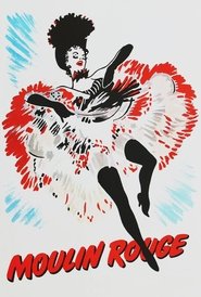
This is where the fight starts — literally a fight, because Technicolor's own technicians resisted what Huston and cinematographer Oswald Morris were doing to their pristine format. Using fog filters, colored smoke blown across the set, and gelled lights, they dirtied the image at the source: reds pushed toward brick, ambers toward haze, every edge softened as if seen through gaslight and cigarette smoke. The opening can-can sequence is the manifesto — a spectacle of pleasure deliberately veiled, so that the color feels like memory rather than record, closer to Toulouse-Lautrec's posters than to the candy-bright musicals playing next door. The film inherits the idea that color could serve painting rather than realism from earlier Technicolor experiments like Black Narcissus, but it is the first to argue that less color could mean more feeling. Every film in this course descends from that argument.
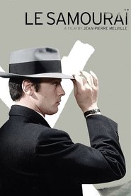
Fifteen years later, Melville and cinematographer Henri Decaë take Huston's smoky warmth and refrigerate it. Le Samouraï is a color film that behaves like a black-and-white one: greys, blue-greys, the pale institutional walls of a hitman's bare apartment, Alain Delon's trench coat and fedora rendered in tones a shade away from monochrome. Where Huston desaturated to evoke a painter's nostalgia, Melville desaturates to erase warmth entirely — the palette is the character, a man who has stripped his life down to ritual and routine. Watch how sparingly Decaë lights Delon's face: shadow does the work expression won't, and the grey half-light of the opening — a man lying dressed on a bed, a caged bird stirring, minutes passing before anyone speaks — sets a standard of chill that the corporate thrillers of the 2000s will spend decades trying to match.
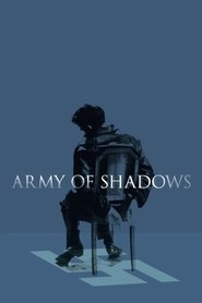
Melville again, pushing his own invention from style into weather. Pierre Lhomme's photography renders Occupied France as a world of perpetual overcast — grey, blue-grey, the occasional dim ochre of a lamp in a safe house — as if the Occupation had blotted out the sun itself. The crucial development here is moral: in Le Samouraï the drained palette belonged to one man; here it belongs to history, a whole nation living under a lid. Lhomme keeps the camera at a distance, favoring medium and wide shots, so that the greyness is never decorative — it is the air the Resistance breathes. This is the film that establishes desaturation as the honest register for depicting war and occupation without glamour, a lesson Black Hawk Down and All Quiet on the Western Front will take up thirty years on.

The palette turns toxic. Jeff Cronenweth — son of the cinematographer who shot Blade Runner — replaces Melville's dignified greys with institutional greens, bilious yellows, and cold fluorescent murk, an aesthetic of deliberate ugliness aimed at the beige comforts of 1990s consumer life. The innovation is satirical: desaturation here doesn't mourn a lost world, it indicts a present one, draining the color out of IKEA catalogs and office parks to show the anemia underneath. High contrast and deep shadow let faces flicker in and out of legibility — fitting for a film that plants deceptions in the image itself, including single frames spliced in where no one thinks to look. Where Melville's grey was discipline, Fincher's is sickness, and it became the most imitated look of its decade.

The Swedish outlier, and the course's strangest station: desaturation as paint. Andersson built his film entirely inside a Stockholm studio, on constructed sets with painted backdrops, and the pallor — flat grey skies, chalky faces, rooms the color of old porridge — is applied rather than filtered, uniform across every locked-down, never-moving wide shot. Nothing here is drained from reality; the drained world is built from scratch, which gives the film its eerie quality of a diorama of civilization at a standstill. His image of a traffic jam that will never clear, stalled cars under a flat grey heaven, is the palette's logical endpoint: a color scheme for a society that has run out of forward motion. It shares more with Melville's overcast Occupation than with anything in Hollywood — greyness as collective condition, not personal style.
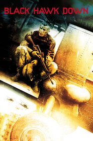
Here the drained image goes to war at industrial scale. Sławomir Idziak — famous for richly saturated, painterly European art films — deliberately inverted his own reputation, shooting Mogadishu harsh, dusty, and undersaturated, with handheld cameras and long lenses turning the city into abraded texture: sand, smoke, sun-bleached concrete. The technique to watch is how desaturation merges with agitation — seven cameras running, grain and dust in the air — so that the bled-out color reads as sensory overload rather than melancholy, chaos you can feel in your teeth. It fuses Melville's no-glamour war palette with the newsreel roughness pioneered by The Battle of Algiers, and it fixed the visual grammar of the modern combat film so completely that two decades of war pictures have shot in its shadow.
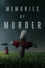
The Korean new wave absorbs the muted palette and slows it down. Kim Hyung-goo shoots rural 1980s Korea in the tones of wet earth and overcast harvest — golds gone to mud, greens gone to grey — in wide anamorphic frames where the landscape carries as much weight as the people in it. The invention is one of emphasis: where a Hollywood procedural would isolate its clues in close-up, Bong lets the drab countryside absorb everything, the camera drifting past a crime scene the way you'd survey a field. The desaturation here is historical memory — the visual texture of a period lived under dictatorship and fog — and it demonstrates that the drained palette had become a fully international language, as fluent in a Korean rice paddy as in a Paris apartment.
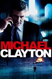
Desaturation puts on a suit. Robert Elswit lights law offices, hotel corridors, and pre-dawn streets in steely blues and fluorescent greens, reviving the deglamorized realism of the 1970s conspiracy thriller — the lineage of The Parallax View and All the President's Men — for the age of corporate damage control. The precise thing to watch is the light sources: almost everything is lit as institutions actually are, by overhead tubes and grey windows, so the muted palette feels found rather than imposed. One dawn shot — a man on a frozen hillside watching three horses in the half-light — shows what this restraint buys: when a single moment of natural, breathing light finally arrives, it lands like a thunderclap. This is Melville's chill transplanted into American office towers.

Fincher and Cronenweth reunite, and the palette finds its new sun: the laptop screen. Digital cinematography and digital grading now allow color to be suppressed with surgical control — warmth removed almost entirely, interiors blue-grey and underlit, faces surfacing out of shadow lit by the cold glow of the very machines the characters are building. That is the film's quiet formal joke and its thesis: the source of light is the source of the trouble. Compare it with Fight Club eleven years earlier — the grunge and bile are gone, replaced by a polished, airless chill — and you can see the desaturated image completing its migration from rebellion to precision instrument. This is the moment the drained palette becomes the signature look of prestige cinema about power.
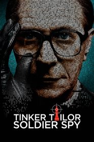
The palette as period reconstruction. Hoyte van Hoytema renders 1970s London espionage in tones of nicotine, weak tea, and municipal beige — a desaturation that is also an act of history, since it revives the drab anti-glamour tradition of the 1960s le Carré adaptations while filtering it through a cool Scandinavian eye. The technique to study is enclosure: characters framed through frosted glass, doorways, partitions, and spectacle lenses, the muted color making every surface feel handled, fatigued, kept secret too long. Where The Social Network's grey is sleek and new, Alfredson's is worn and archival — the same palette split into opposite tenses. It proves the drained image can carry nostalgia and suspicion in a single frame.

Bradford Young takes desaturation into awe. His grey-green palette — calibrated to overcast Montana skies and the fogged interior of an alien chamber — comes with a second subtraction: light itself, faces half-described, backgrounds swallowing detail. The innovation is emotional recalibration. Every previous film in this course used the drained palette for exhaustion, corruption, or dread; Arrival uses it for humility — the muted world of a linguist asked to listen rather than fight, where the one warm register belongs to memory. Watch how the film's science-fiction spectacle refuses spectacle-lighting: the ships hang in mist, and wonder arrives in half-light. It is the palette's gentlest hour.
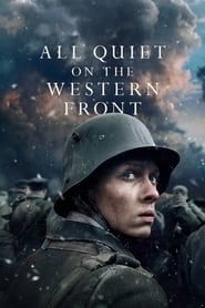
The arc closes where Melville's Army of Shadows pointed: total war, total grey. James Friend shoots the trenches in cold steel-blue and mud-brown, and the opening sequence — a dead soldier's uniform stripped, laundered, stitched, and reissued to a new boy, cut with the rhythm of an inventory — states the palette's final meaning: this is the color scheme of a machine that consumes bodies and recycles the packaging. Modern digital grading gives Berger a control Huston could only dream of when he was blowing smoke across a Technicolor set, yet the goal is recognizably the same — color bled out until the image itself testifies. Seventy years of technique arrive here fully industrialized, in service of the same refusal of glamour that drove Melville's Resistance fighters through their permanent overcast.
What began as sabotage became a grammar. Huston and Morris had to physically outwit their film stock to mute it; Melville turned that muting into a moral temperature; Fincher weaponized it against consumer comfort; Andersson painted it onto false skies; Idziak roughed it into combat texture; and by the digital 2010s — Elswit's fluorescents, Cronenweth's laptop glow, van Hoytema's nicotine haze, Young's fog, Friend's steel — desaturation was no longer a fight but a dial, turned with a colorist's mouse. Yet the meaning has held astonishingly steady across seventy years: a drained palette is cinema's way of saying don't trust the surface of this world — something underneath it is wrong, or tired, or hidden. Watch these twelve in sequence and you'll never again see a grey-green thriller, a smoke-blue war film, or an office lit like an aquarium without knowing exactly which battles, chemical and otherwise, were fought to make that dimness speak.